
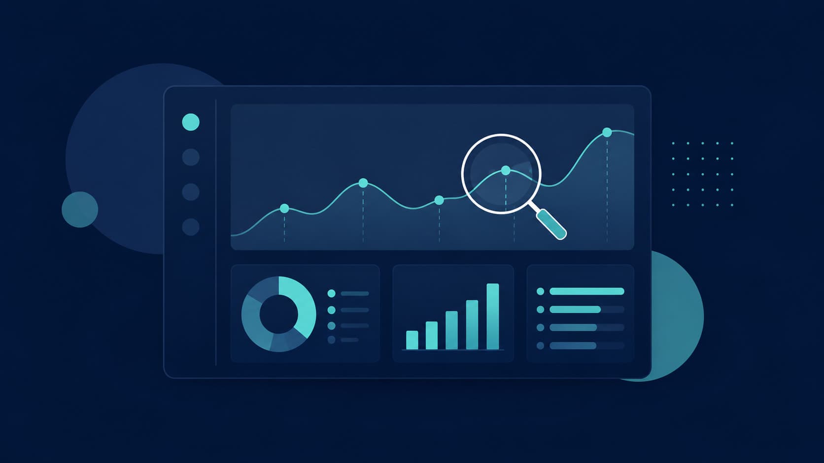
A Database Viewer Is Not a Dashboard
Most early-stage admin panels start life as exactly what they sound like: a set of screens that list rows from the database and let someone on the team edit a field or two. That's genuinely useful — support needs to look up a user, correct a typo in an address, or manually mark an order as refunded. But a table of user records answers "who is this person," not "what are our users doing, and why." Those are two different tools solving two different problems, and conflating them is the most common reason founders feel like they have "a lot of data" and no actual insight.What 'Explaining Behaviour' Actually Means
A dashboard that genuinely explains customer behaviour does three things a plain record viewer doesn't:- Funnels — shows where people drop off between signing up and reaching real value, not just that they exist as a row in a table.
- Segments — groups users by what they actually do (features used, plan tier, activity level), so "our users" stops being one flat number.
- Trends over time — shows whether this week's numbers are a real shift or ordinary noise, which a single snapshot of current records can never tell you.
The Two Layers You Actually Need
Your Internal Admin Panel
This is the operational layer — the screens your support and ops team use to look up a specific customer, fix a data-entry mistake, or manage permissions. It should be fast, role-restricted, and boring by design. If your admin panel is also where someone tries to answer "is retention improving," that's a sign it's being asked to do a job it wasn't built for.A Product Analytics Layer
This is the behavioural layer, and in 2026 the realistic shortlist is short. PostHog has become the default for engineering-led teams — open-source, self-hostable if you want full data ownership, and it bundles analytics, session replay, and feature flags in one place. Mixpanel leans toward product teams who think in terms of individual users and cohorts rather than raw event counts, with a more polished, less SQL-heavy interface. Amplitude is built for scale — strong account-level analytics for B2B products — but it's genuinely overkill for a product still under a hundred thousand monthly users. For most early-stage founders, the right move is picking one of these, instrumenting five to ten events that actually matter, and reviewing the data weekly, rather than trying to track everything from day one.Watch Out: Test and Dev Data Pollutes the Real Picture
This is the trap that quietly ruins even a well-built dashboard: your own team's testing activity gets counted as real user behaviour. Sandbox purchases from App Store testing, TestFlight beta testers, staff accounts poking around in a staging environment, and webhook events fired by a dev integration you're still debugging — none of that should land in the same funnel as your actual customers, but unless someone deliberately filters it out, it does. A spike in "signups" that's really your QA team running through a checklist, or a conversion rate that looks worse than reality because sandbox transactions never complete, leads founders to make real decisions on fake data. If your team is testing App Store subscriptions before launch, our guide on testing StoreKit, sandbox, and TestFlight properly covers keeping that environment cleanly separated from production — the same separation needs to carry through into whatever tool is measuring real behaviour.Questions Your Dashboard Should Answer in Under a Minute
A genuinely useful setup, whichever tools you use, should let you answer these without asking an engineer to run a query:- How many people signed up this week, and which channel did they come from?
- What's the difference in behaviour between users who renew and users who churn?
- What's the first feature a power user touches, versus someone who never comes back?
- Is this week's drop in activity a real trend, or normal variation in a small sample?
- Which segment of customers is actually driving revenue, versus which one is just noisy?
More data isn't the same as more insight. A dashboard earns its place by answering a specific question fast, not by displaying everything the database happens to contain.
Common wisdom among product-led growth teams
How We Approach This at Fall Rise
When we scope a product build, we treat the internal admin panel and the analytics layer as two separate design decisions, not one screen doing double duty. Access to each is shaped by who actually needs it — the same role-based access control principles that protect customer data also determine who should be able to see behavioural trends versus who just needs to look up a single account. On platforms like FieldOps, where operations teams need a real-time view of what field staff and customers are actually doing, this distinction is the difference between a dashboard people check every morning and one nobody opens after week two. If you want a deeper look at what "explaining behaviour" looks like in practice, we've written about the segmentation and retention patterns behind it in how smart content delivery boosts retention. Building both layers is the core of our admin panel and dashboard development work, alongside the backend API that feeds them.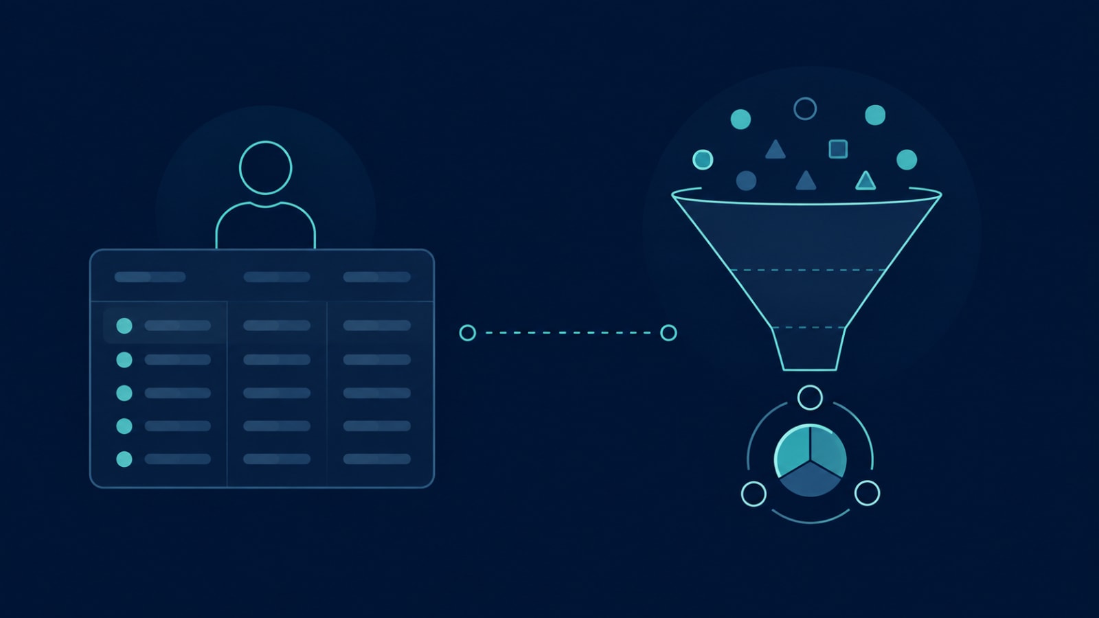
An admin panel full of records isn't the same thing as a dashboard that explains your customers — and most early-stage products only ever built the first one. If you're not sure whether your current setup can actually answer "why," not just "what," let's talk. Getting the two layers right from the start is far easier than retrofitting insight onto a system that was only ever built to store data.