The Core Difference: Pull vs. Push, Live vs. Snapshot
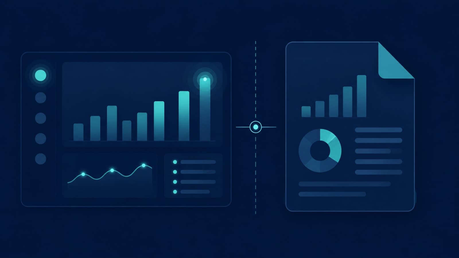
A dashboard is something people pull — they log in whenever they want to check it, and the numbers are live or close to it. A report is something that gets pushed to people on a schedule — sent by email or shared as a document, built from data as of a specific moment in time. Dashboards favor speed and pattern recognition: several metrics sitting side by side so someone can scan and move on. Reports favor narrative and depth: charts paired with written context that walks someone through what happened and why it matters, because the reader wasn't watching the numbers move in real time the way a dashboard user was.When You Actually Need a Dashboard
- Someone on your team needs to check the same few numbers every single day — a support queue, today's signups, current order status.
- The value is in catching a problem as it happens, not reading about it after the fact — a payment failure spike, a server error rate, a delivery running late.
- The audience is operational, not narrative — they want to glance, act, and move on, not read three paragraphs of context first.
- Different people need to slice the same data differently — support wants tickets by agent, ops wants tickets by category — which calls for filters and drill-down, not a fixed set of charts.
When You Actually Need a Report
- The audience checks in periodically, not daily — a monthly investor update, a quarterly board review, a weekly summary for a stakeholder who isn't in the product day-to-day.
- The point is to explain why something happened, not just show that it did — a report can carry a written narrative next to the numbers; a dashboard generally can't.
- You need a fixed, shareable snapshot — something that can be emailed, archived, and referenced later exactly as it looked at the time, without the numbers shifting underneath the reader.
- The audience isn't going to explore the data themselves — they want the conclusion handed to them, not a set of filters to figure out on their own.
Why Teams Build the Wrong One, Then Blame the Data
This mismatch is almost never a data problem — it's a briefing problem. A team asked to build "a dashboard" defaults to what that word usually means technically: live, interactive, filterable. If what the requester actually needed was a monthly PDF with three charts and a paragraph of context, that's a completely different build, and discovering the mismatch after the first version ships means redoing real engineering work. This is the same root cause behind the blind spots we covered in what your dashboard probably isn't telling you — a tool built without a clear question in mind ends up technically functional and practically useless. The fix in both cases is the same: get specific about who's looking at this, how often, and what decision it's meant to support, before anyone opens an editor.Nobody has ever complained that a report was too clear or a dashboard was too fast. They complain when they got the wrong one for how they actually work.
Common wisdom among BI and analytics teams
A Simple Way to Brief Your Dev Team
You don't need BI vocabulary to ask for the right thing — four questions, answered honestly, will point you to dashboard or report almost every time:- How often will someone actually look at this — multiple times a day, or once a month?
- Does the audience need to explore the data themselves, or do they want a conclusion handed to them?
- Does this need to reflect what's happening right now, or is a snapshot from this morning good enough?
- Will this get shared outside the tool — emailed, archived, presented — or only ever viewed by someone logged in?
How We Approach This at Fall Rise
Before we build any reporting surface, we start with the same four questions above rather than assuming "dashboard" means what the client thinks it means. For a product like RentEra, that's meant separating the daily operational view staff actually work from — live, filterable, checked constantly — from the periodic owner-facing summaries that don't need any of that interactivity, just a clear monthly story. Getting this distinction right upfront, as part of our admin dashboard and reporting development and the underlying backend API work, avoids building an expensive interactive tool for an audience that only ever wanted a clear monthly email.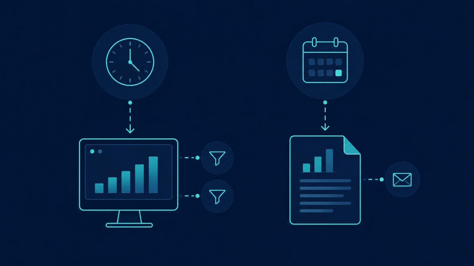
Asking for "a dashboard" when you actually need a report — or the other way around — is one of the most common and avoidable sources of wasted build time. If you're not sure which one your team, your board, or your customers actually need, let's talk. A short conversation up front is far cheaper than rebuilding the wrong thing twice.